4 Tips to Optimize your Ecommerce Website for Tablets
About 25% of Americans shop using tablet computers. The tablet is a highly popular device for online shopping. Even Smartphone were not quite as popular when they were in a comparable phase. Every ecommerce business owner will obviously want to cash in on the opportunity to serve this segment. Google is going to extend their Google Shopping in Mobile and Tablets, this is an added advantage of optimizing an ecommerce site for tablets.
The need of the hour is to build ecommerce website that performs just as well – or better – as it does on a laptop or desktop. The form, structure, design, and content on the original site should not only be accommodated in the tablet version but also work just as well – or even better.
So how do you optimize the tablet version of your site for best results?
Here are a few pointers:
Responsive Web Design:
New tech enables developers to build websites that adapt to the screen that the user is using. So whether they visit your site on their Smartphone, tablet, or desktop, all components and content on your site are available with minor and aesthetically adapted changes to the regular site. The overall layout features, and graphics on the site are almost exactly the same as in the regular version, with some of the content made available on an on-demand basis.
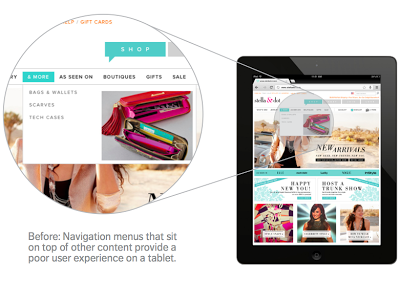
Tablet owners are already accustomed to using their finger or a stylus to navigate. The navigation in your site should also support content sliders for easy access to your product pages. It should not depend on hovering because current tablets do not support the hovering feature. Navigation can be consolidated in a single icon, such as the increasingly popular three horizontal lines.
Images – Beauty with Brains:
Images used on regular websites are not always optimized for aesthetic or even functional purposes. With new tech such as retina display, or the vastly improved screens on tablets, that kind of laxity will just not do. Images in the tablet version of your store or site should display well and load fast. The photographs of products should be of the best possible quality and still load fast. Some of your fast-loading images can be built using CSS. Load time can also be reduced by cutting down on the number of HTTP calls the site must make to load a page.
iPad and Tablet Friendly Technology:
As technology evolves, better ways of displaying websites and new ways of enriching them are emerging fast. It would help to keep tabs on all such developments. Scoring points in this respect will be important for businesses that face intense competition.
Build a great tablet experience for your visitors and customers and attract much more traffic and custom off your website’s tablet version. If you’d like to know more, watch this space or get in touch with us.
+Akshay Vyas: Author and Moderator of "Ecommerce" Community, it has just reached to over 600 members. You should be a part of this community now, let's join.
Happy selling and Have a great day!


.png)


Liked all your posts. I totally agree with the importance of designing websites including shopping cart in such a way that they can be used equally effectively on smartphones and tablets too. Internet is no longer limited to laptops and desktops. It is very very important if businesses dont want to lose this huge market which uses smartphones and tablets.
ReplyDeleteAn e-Commerce web development as revolutionized the way of doing business on internet. By providing the superior quality ecommerce solutions, this business has emerged as the most innovative way of doing business. Further, it has a great impact over the online business.
ReplyDeleteWeb Development Companies | Bangalore Website Developers
This tips are very useful for tablets. The most integral component of ecommerce is the development of your own website.
ReplyDeletemobile ecommerce India